The Ambassadors of the Art Institute wanted me to concept and build a poster to promote the club. The club members wanted something daring and cool to appeal to the creative and rebellious nature of art students.

Click on pictures to enlarge.
Started out with a few basic pose shots. The basic inspiration was "The Usual Suspects" movie Poster. Due to their unusual schedules we had to grab pics when we could. Some pictures where even submitted via camera phone.
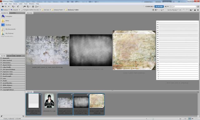
I then grabbed some sample texture to start the building of the environment. I wanted a very dark and grungy look with a play with highlights, contrasts, and drab colors. Color adjustments was done in Camera Raw via Adobe Bridge.
Then moved on to Photoshop and placed the "wall" and "floor". I adjusted the perspective and added a few filters to give it more a feeling of depth.
I then placed the our Crest as if was some type of graffiti. The logo was originally not going to be part of the piece because we had a larger one located outside the poster. But I added it to the piece for harmony of the entire display.
I started to add cracks and wear texture to give the feeling of age to the piece.
Then simply inserting lines and number for a height-line and continued to add more wear and tear on the piece.
Created some shadow effects to give the illusion of over head lighting also to frame up the piece with a sort of vignette.
I then masked out each of the "Suspects" for the piece.
I tried to place them so they would feel as if they all belong in the environment and inter acting with each other.
I then added shadows to pull them from the wall and give the composition more depth. I really tried to place all the shadows in different position from there host based on relative position from the "Wall". I also was careful to add shadow on people who were set behind other people.
Finished product cleaned up and some small addition to add to playfulness of the piece to communicate to the audience that they don't take ourselves to seriously.


No comments:
Post a Comment